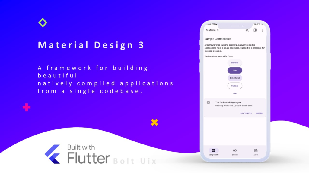
Rounded buttons are a key component of modern UI design, offering a sleek, elegant, and user-friendly experience. With Material Design 3 (M3), Flutter provides even greater flexibility in customizing buttons, allowing developers to create beautiful rounded buttons with ease. In this guide, we’ll explore how to implement rounded buttons in Flutter using Material Design 3.
Why Use Rounded Buttons?
Rounded buttons improve the user interface by:
- Enhancing visual appeal with smooth edges.
- Providing a more touch-friendly experience.
- Aligning with modern design trends, including Material Design 3.
Enabling Material Design 3 in Flutter
Before implementing rounded buttons, ensure your Flutter app is using Material Design 3. Update your pubspec.yaml file:
flutter:
  uses-material-design: true
Then, enable Material 3 in your ThemeData configuration:
import 'package:flutter/material.dart';

void main() {
  runApp(MyApp());
}

class MyApp extends StatelessWidget {
  @override
  Widget build(BuildContext context) {
    return MaterialApp(
      title: 'Rounded Buttons Demo',
      theme: ThemeData(
        useMaterial3: true,
        colorScheme: ColorScheme.fromSeed(seedColor: Colors.blue),
      ),
      home: HomeScreen(),
    );
  }
}
Creating Rounded Buttons in Flutter
Material Design 3 offers several ways to create rounded buttons, including ElevatedButton, OutlinedButton, and TextButton. Below are examples of each:
1. Rounded Elevated Button
ElevatedButton(
  onPressed: () {},
  style: ElevatedButton.styleFrom(
    shape: RoundedRectangleBorder(
      borderRadius: BorderRadius.circular(30),
    ),
    padding: EdgeInsets.symmetric(horizontal: 20, vertical: 12),
  ),
  child: Text('Rounded Elevated Button'),
)
2. Rounded Outlined Button
OutlinedButton(
  onPressed: () {},
  style: OutlinedButton.styleFrom(
    shape: RoundedRectangleBorder(
      borderRadius: BorderRadius.circular(30),
    ),
    side: BorderSide(color: Colors.blue),
  ),
  child: Text('Rounded Outlined Button'),
)
3. Rounded Text Button
TextButton(
  onPressed: () {},
  style: TextButton.styleFrom(
    shape: RoundedRectangleBorder(
      borderRadius: BorderRadius.circular(30),
    ),
    padding: EdgeInsets.symmetric(horizontal: 20, vertical: 12),
  ),
  child: Text('Rounded Text Button'),
)
Customizing Rounded Buttons Further
Material Design 3 allows further customization with:
Using a Custom Color Scheme
ElevatedButton(
  onPressed: () {},
  style: ElevatedButton.styleFrom(
    backgroundColor: Colors.purple,
    foregroundColor: Colors.white,
    shape: RoundedRectangleBorder(
      borderRadius: BorderRadius.circular(50),
    ),
  ),
  child: Text('Custom Color Button'),
)
Adding Icons to Rounded Buttons
ElevatedButton.icon(
  onPressed: () {},
  icon: Icon(Icons.thumb_up),
  label: Text('Like'),
  style: ElevatedButton.styleFrom(
    shape: RoundedRectangleBorder(
      borderRadius: BorderRadius.circular(30),
    ),
  ),
)
Conclusion
Rounded buttons in Flutter with Material Design 3 enhance your app’s UI while improving usability and accessibility. By leveraging ElevatedButton, OutlinedButton, and TextButton with rounded edges, you can create modern, stylish buttons that align with Material 3 principles.
Check out: Mastering Material Design 3 in Flutter: Theming and Customization for Stunning Apps
Try implementing these in your next Flutter project and elevate your app’s design! Need more UI inspiration? Check out Dribbble’s Flutter UI designs or explore Material 3 button documentation for more details.